Project Overview
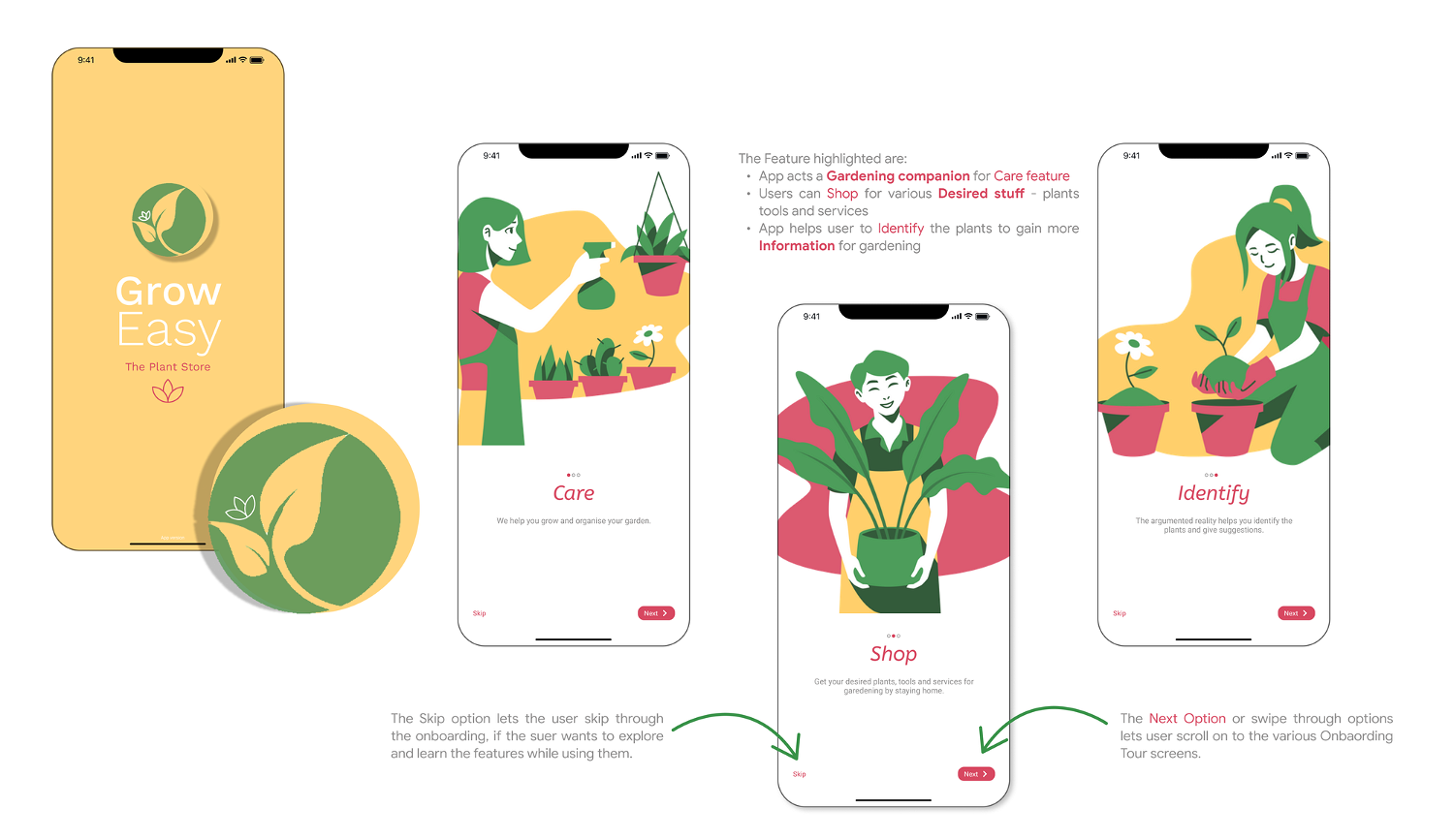
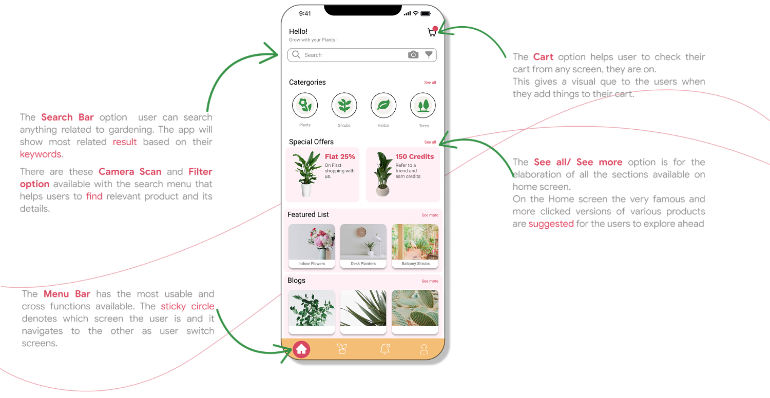
GrowEasy is a multi-functioned app for gardening and plant business for a plant store. It caters to the functions of gardening and plant growth which helps the customer to have a healthy green space.
My Role
Researching & Identifying the needs, developing of the best-suited process to find the solution. Building upon the final product (Web & Mobile Interface)
Chapter 1: Discovery 💡
With each passing day in the pandemic, People got more and more to indoors call it stuck or make it through the hard times. This gave people a lot more time to introspect and analyse. We folks are finding a lot of new hobbies, and tasks and have started exploring various activities. One of them being Gardening or having Plants.
Check the Video out to discover if you are one. 😛
In today's world, when everyone is busy in their work and feeling stressed and depressed due to work and a lot of mind-stuck and are not much connected with nature nowadays. Plants are the best options to improve your surrounding environment, control pollution and plant help in many ways.
I decided to map down my own cycle of becoming a planting interested person. How and where the difficult points were faced and how did I tackle them.
Chapter 2: Define
❶ I began with defining the Activities → Mapping out the Plant Parenting Process

From having a plant in one’s home or indoor space in urban areas with crunched or smaller spaces. Thus, Planting in portable and small growing plants. The major activity required after having a plant is taking care of its active growth, nurturing & maintenance.
With pieces of nature, the effect of care is very crucial as they can get sick or even die without proper care with proper light and ventilation. So the majority of problems rely on the care and environment of plants.
❷ Moving on with listing down issues → Understanding the problems faced while having plants.
People face problems with plants and their growth and care mostly are dependent on-
- Many people start doing gardening to improve the quality of air around them to beautify their house, but they give up after some time even when they love gardening.
- As mostly it is an indoor environment with limited access to the outdoor environment.
- People are unable to go and buy plants from shops and nurseries.
- Caring for a plant is a difficult job. Lack of all kinds of wholesome information related to various steps to be taken for the care and growth.
❸ After that looking at the reasons behind the issues → Why?
- People don’t have enough knowledge.
- There is no one to guide and it’s about hit and trial versions.
- People tend to forget about the plants because of their busy schedules.
- Sometimes, don’t know why their plants are dying.
Brainstorming
Thus defining the project brief to have a platform for plants parents, new and old where they can map the journey.
Here-in to keep in mind, that there can be newcomers who are starting their planting process and the existing user base who have experience and faces issuesEncourage users to do gardening, help them to engage with other gardeners in the community, make it easy for them to identify the plants and diseases.
Here-in some constraints that were set:
- The focus is on the potted plants and new seedlings.
- Tackling the problems of struggling with proper care of plants.
💡 Initial Ideas
- Create a community of gardeners.
- Give reminders to take care of the plants.
- Easily scan the plants to identify them or to identify the diseases.
Chapter 3: Identify
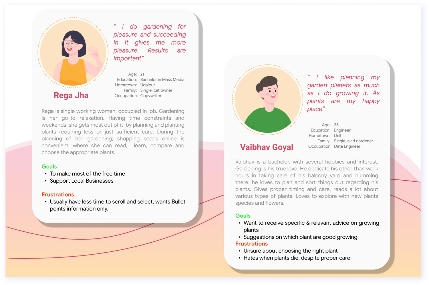
I started off at the most important juncture: Who? The Users defining the User Personas
Based on the research conducted, during the discovery phase, various persona was created, to understand the types of users. Designing for different customers with various needs helped in making informed design decisions as it ensured the end-user was always in mind.
After defining the User personas, Now let’s map the Empathy Mapping for the users. Based on the initial discovery's about the issues of the Plant Parents, Here-in to analyse What users Say, Thinks, Feels, and Does to understand the user and about their activities related to product goal.
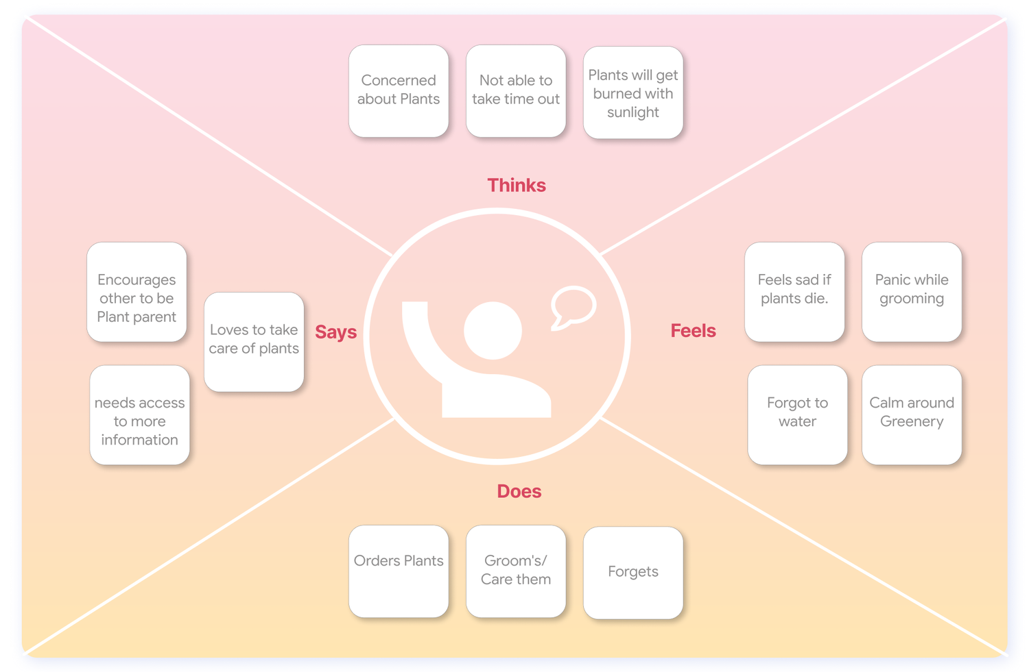
To understand the empathy mapping
- Does
This lists out the various activities a user carries out usually to nurture their plants.
- Says
This defines the needs of the user as they are plant parents who love plants are ready to explore and engage others in the conversations. This maps out that they are keen to grab new knowledge and discover more about plants.
- Thinks
Here, the critics about the plants and the lifestyle are laid, as in the plant parents are concerned and interested in plants, their growth and care.
- Feels
Plant parents feel overwhelmed by the various information and the lack of the correct one at times, which creates panic.
Based on the certain kind of mind-map created through the above analysis of the user persona. The various activities one could perform, i.e following a plant parent journey.

Tracking the activities by looking at → User Journey Map
The mind map of Users within the whole process of having a plant and the features to explore based on the Initial Ideas laid during the define phase.
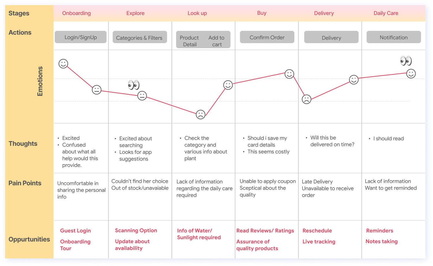
Mapping the user journey through the various activities, to make some observations and understand the pain points.
Observations
- The user wants clear and on-point Information.
- Sceptical about the quality.
Pain-points
- Lack of clear information the user is looking for.
- Numerous amount of reminders about the Daily activities.
Chapter 4: Ideate
Looking out for some key Features to have to create a product that makes way through the issues and solves the problems.

From this I settled on two main requirements for a minimum viable project:
1. Allow the user to buy new and add their old plants to the app. 2. Reminders for the user when they need to do a specific activity about the plant.
❶ Affinity Clustering
Visual Sorting of data into related clusters according to similarities. Similar topic areas post-its are collected together into clusters.
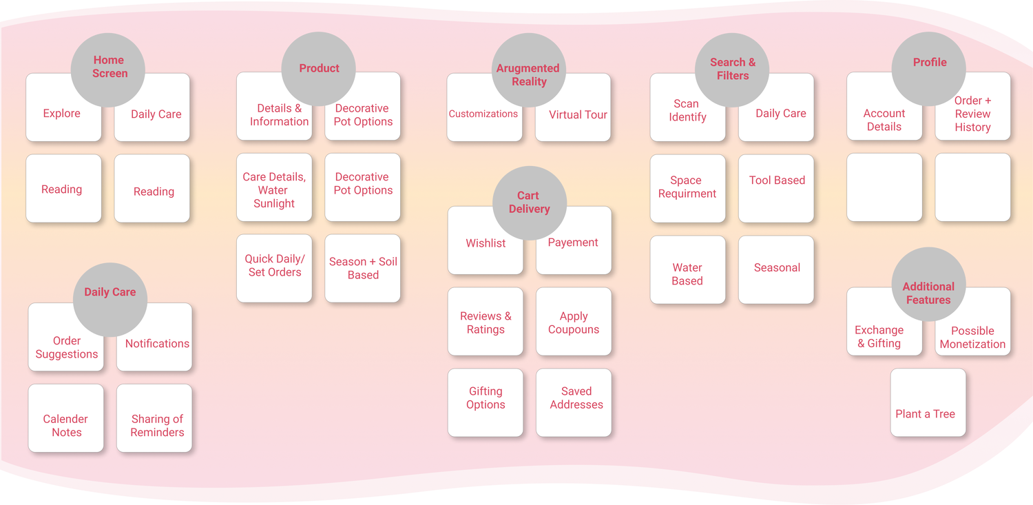
❷ Now to understand the “What goes where” of the new features, I sat down and tried out various user flows and placement of functions and finalised the following-
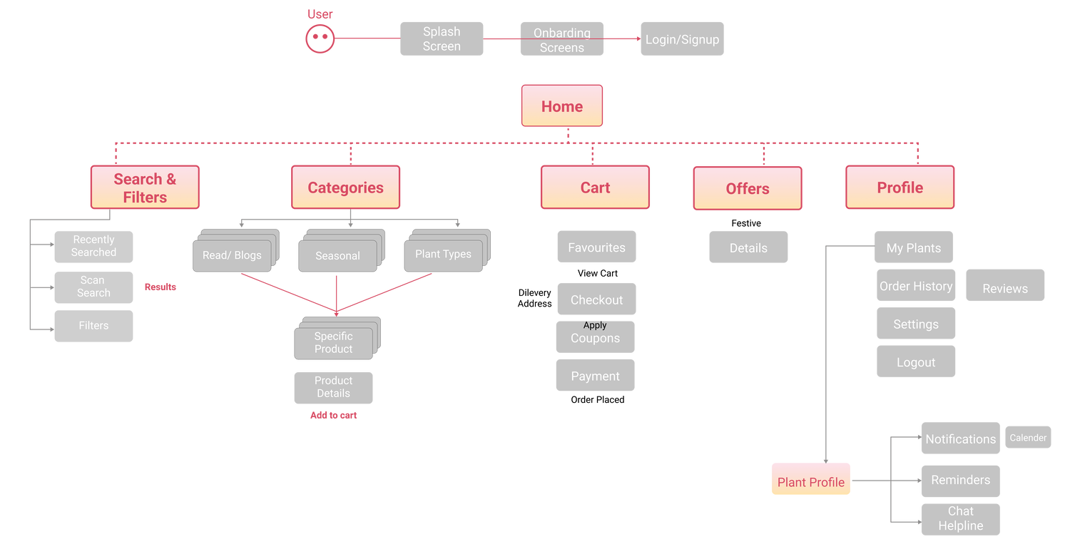
This is to lay out each individual screen, and how the user flow happens. The lets us determine based on user needs so that the user can easily find the information they need. A flow that lets users navigate between screens without much effort.
Chapter 5: Explore - Wireframing
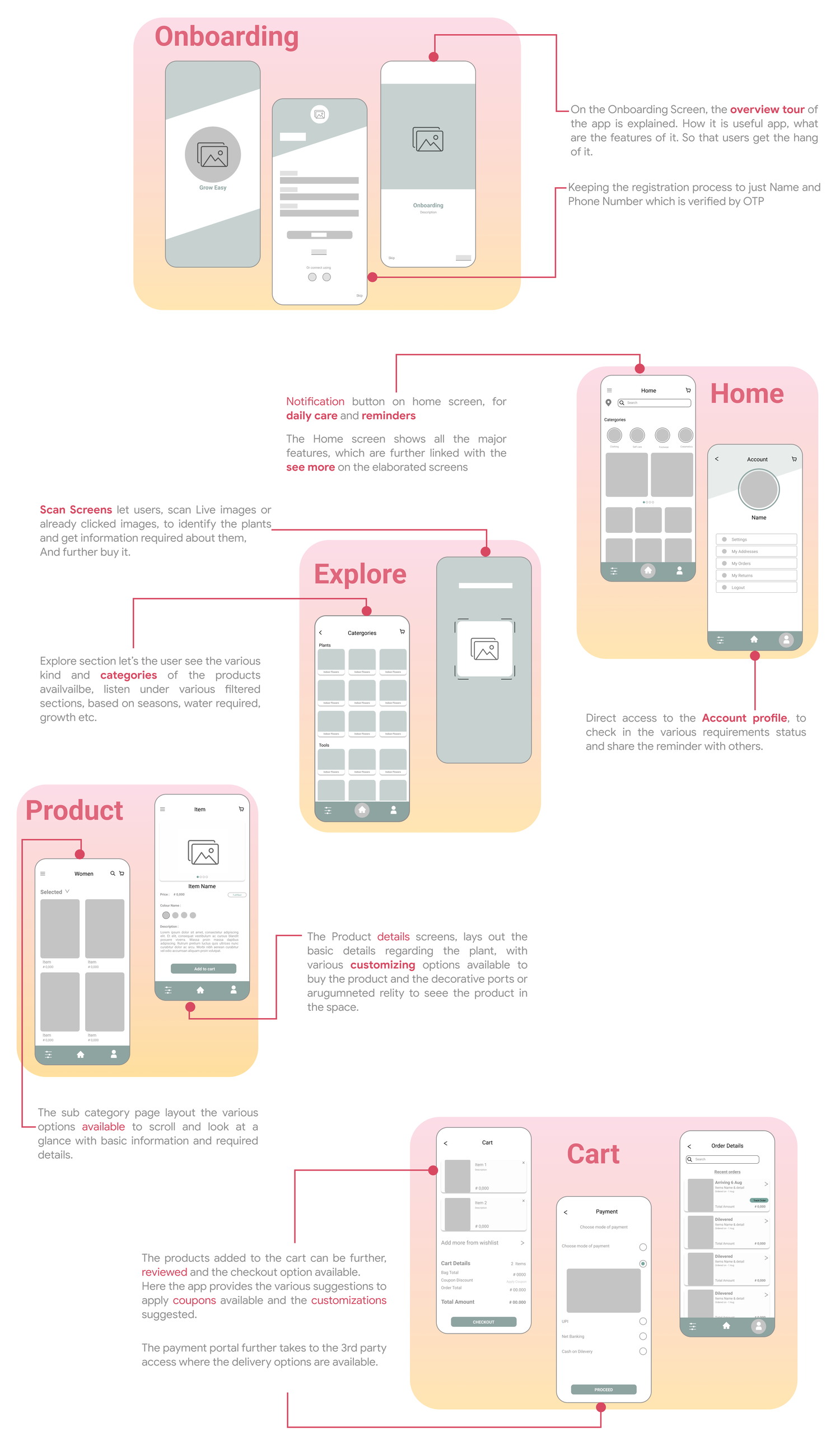
The wireframe screens are the layout of a design, where the different features and the clusters are together mapped and how user flow happens is demonstrated. To understand what interface elements will exist on key pages. It is a critical part of the interaction design process
Chapter 6: Design
