Typography is the art of arranging letters and text in a way that makes the copy legible, clear, and visually appealing to the reader. It involves font style, appearance, and structure, which aims to elicit certain emotions and convey specific messages.
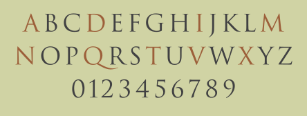
Typefaces
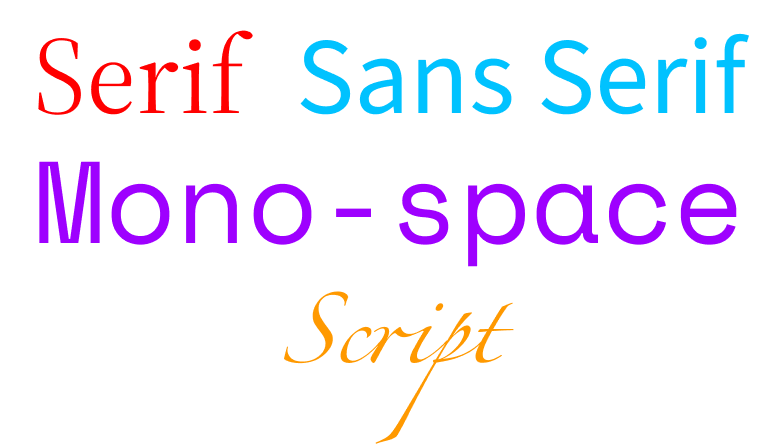
A typeface (or font family) is the design of lettering that can include variations in size, weight (e.g. bold), slope (e.g. italic), width (e.g. condensed), and so on. Each of these variations of the typeface is a font.
Colour
Colour us what we all know, and see. It is the visual perception based on the electromagnetic spectrum.
Comprises of
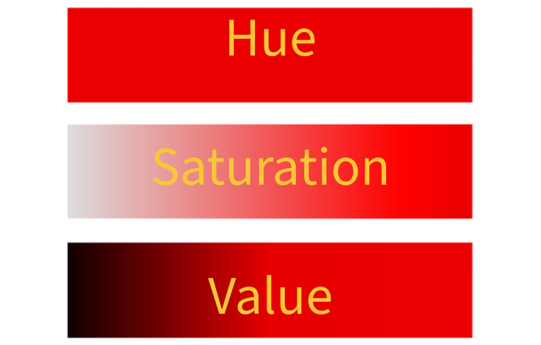
- Hue - The colour of the colour, such as red, orange, yellow, green, red, blue, indigo, violet.
- Saturation - Intensity of colour, desaturated colour tend to look grey.
- Value - The lightness(tint) and the darkness(shade) of the colour.
Hierarchy
Hierarchy is organising of various texts using size with addition to typeface and colour. It helps in conveying the importance of the text.

Alignment
Alignment is in context with the page, as to of which part it is anchored to.

Space
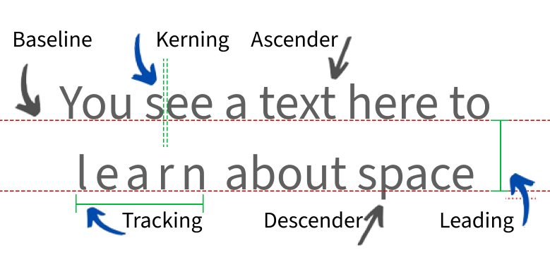
- Leading (Line spacing)
- Tracking (Letter Spacing)
- Kerning (space between pairs of letters)
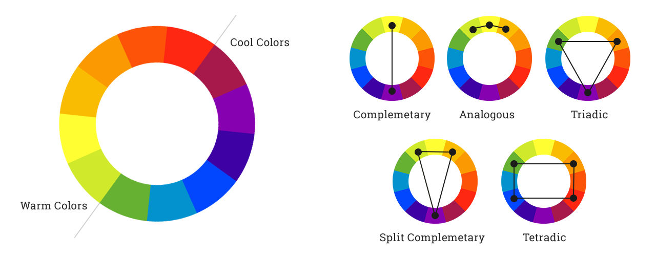
Colours Schemes
